
Created on 99designs by Vista
Text is custom drawn.
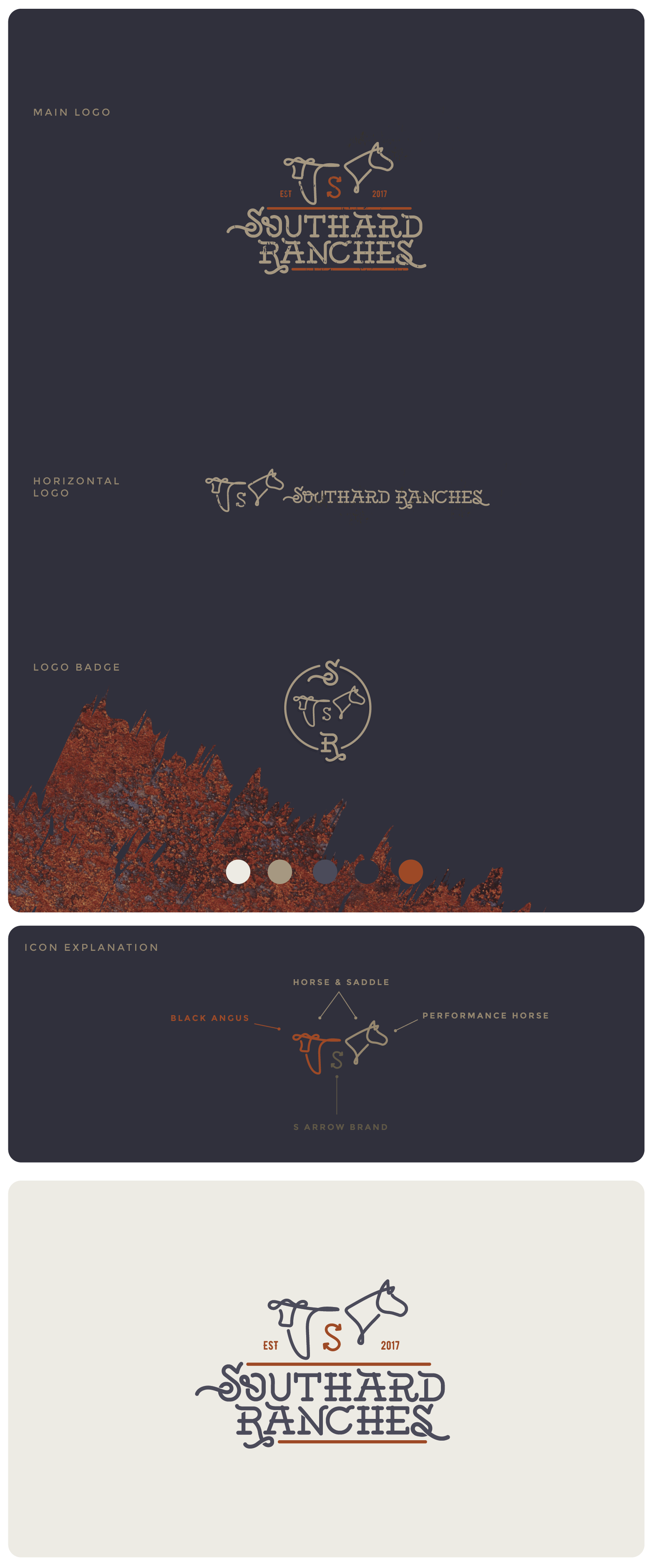
For the Icon I took the black angus and the horse and created a modern but classic icon. I kept their signature S shaped brand in the center of the icon, where it could also be seen as a brand on the cow and the horse.
You will also notice that at a quick glance or if you squint your eyes and look at the icon the cow actually looks like the horse's saddle. So it has some visual trickery, lol.
I kept the colors blue and red but used muted colors, like rust for the red and a deep grey blue to make it look more classic and natural.