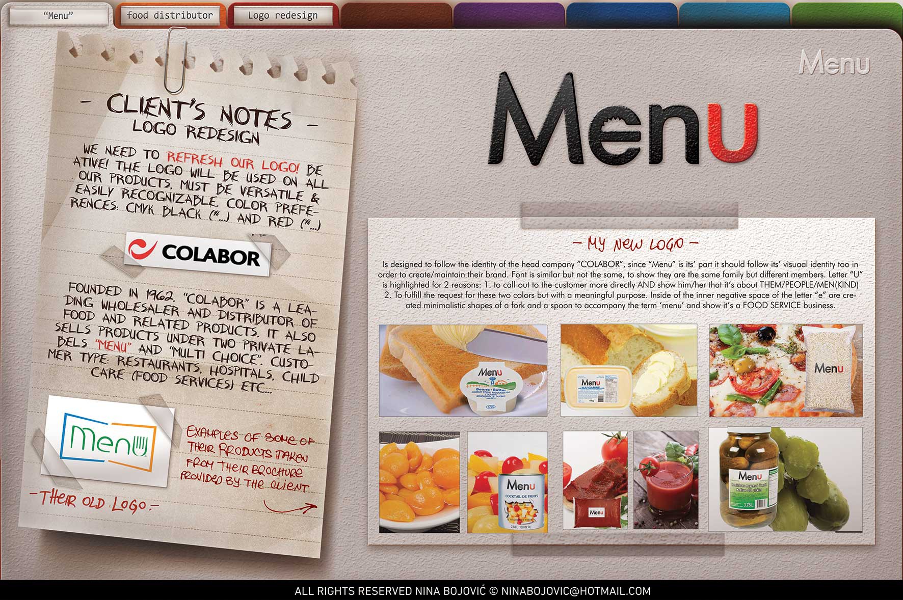
Knife and spoon hidden in negative space of letter 'e' to associate to dining and 'U' to directly communicate to the viewer. But I don't like how 'men' gets extracted since it's not gender oriented business.