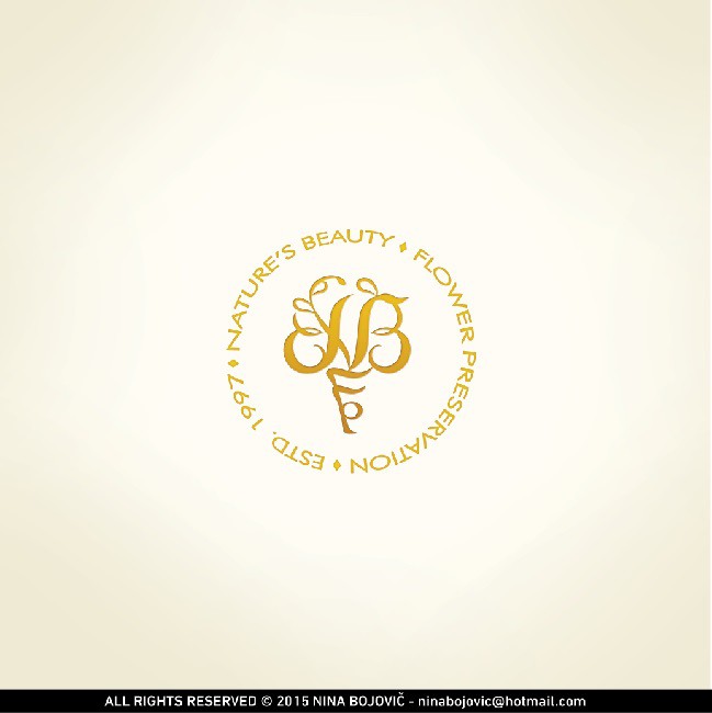
Luxurious logo for preservation of wedding bouquets co.

4
Created on 99designs by Vista
Design was created to look like company's product of preserved wedding bouquet in a sphere. I used their lenghty name as an advantage to create the circle to associate to that, but also to keep the logo in circular form which is the most practical for placement on all formats, just like square one is. Sign is constructed of their custom initials "NBFP" in script manner to associate weddings, but name of the company is in "Futura" font to associate to modern techniques. I chose gold as main color because it symbolizes long-lasting value and luxury.