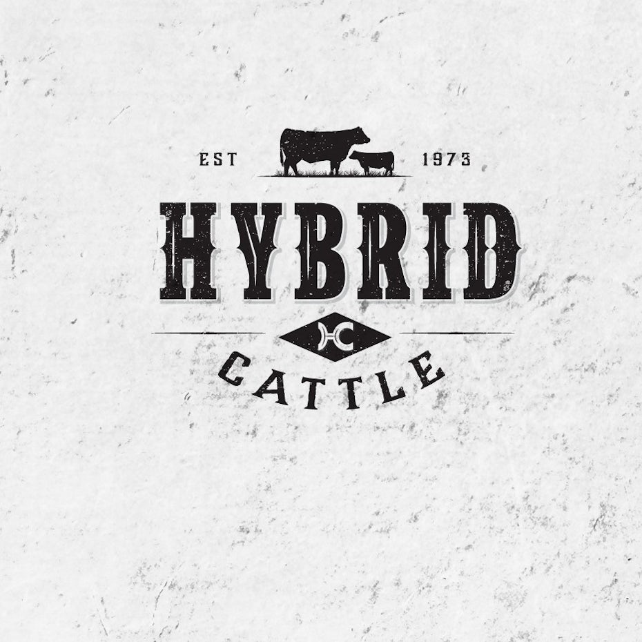
Farming has changed a lot in the last, oh, say, several thousand years. logos and branding have evolved, too. You can no longer just stick your initials on the end of a hot iron to mark your cattle.
To the average consumer, one carrot is probably just as good as another. The product itself is difficult to distinguish, so you have to establish a brand that separates you from the other sellers. Once the customer associates your brand with quality, the individual bag of carrots won’t matter as much.
Your logo, as part of a larger branding effort, is a great first step to separate you from the competition. Why should they buy from you instead of a competitor? What makes you different? If you could distilled that which makes him special into a single image, then you’ve got yourself an effective logo.
Take a look at some awesome farm logos for inspiration.
Greener pastures
—
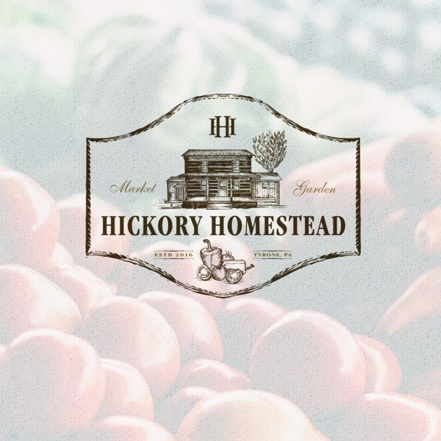
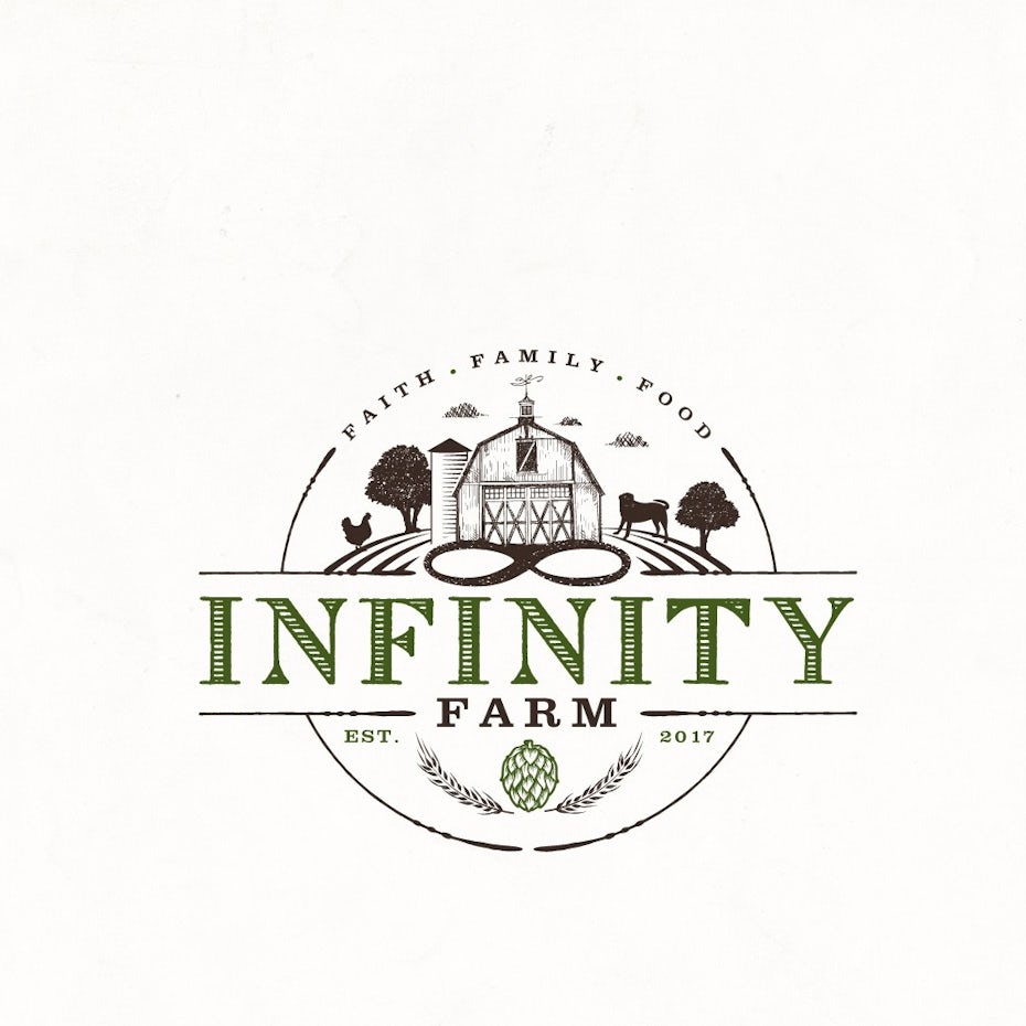
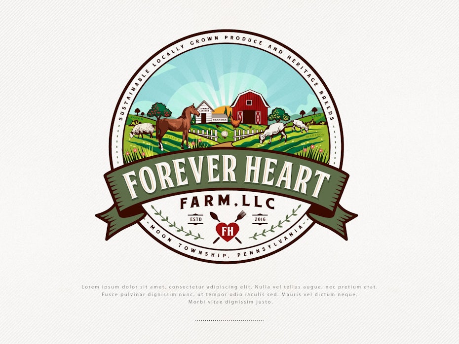
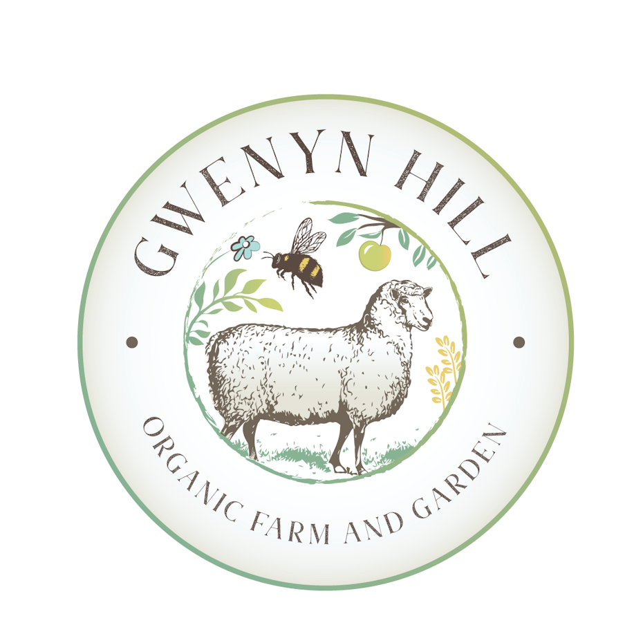
Farming is a uniquely personal job. You live on the land that you work. Your home is likely right next to the fields, and the stables and barn. It’s a way of living that most of us in the city have forgotten.
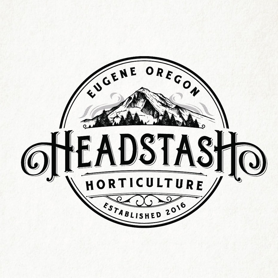
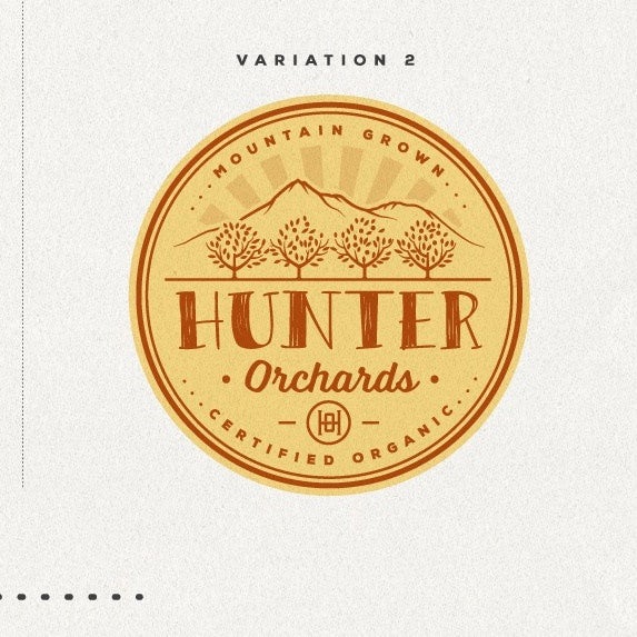
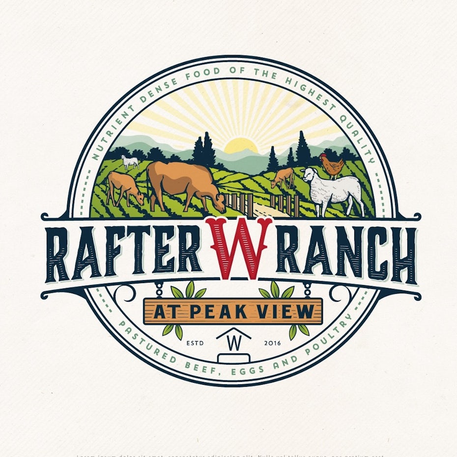
You can remind your customers of the pastoral life that once was in your logo. emphasize the hands-in-the-dirt nature of farming. Barns, homesteads, even open fields are all great iconography to use in this type of logo.
Fruit of your labor
—
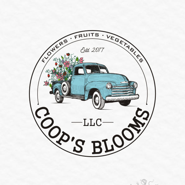
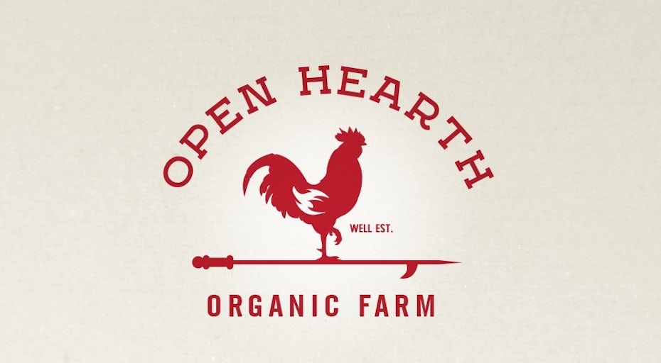
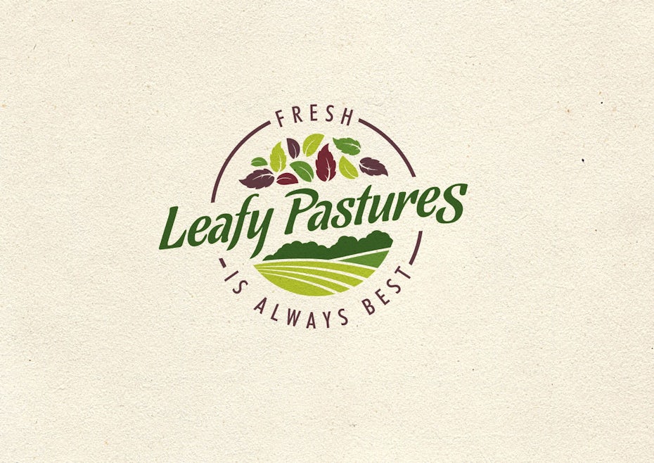
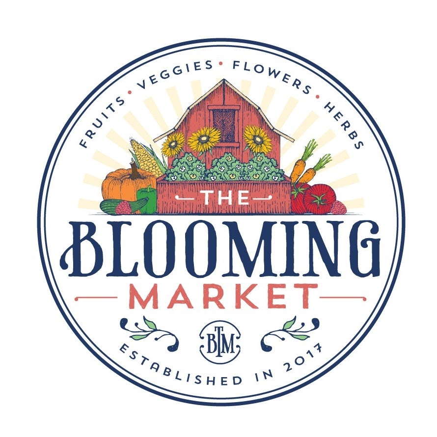
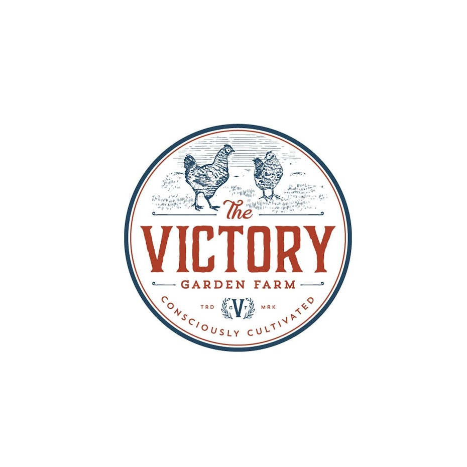
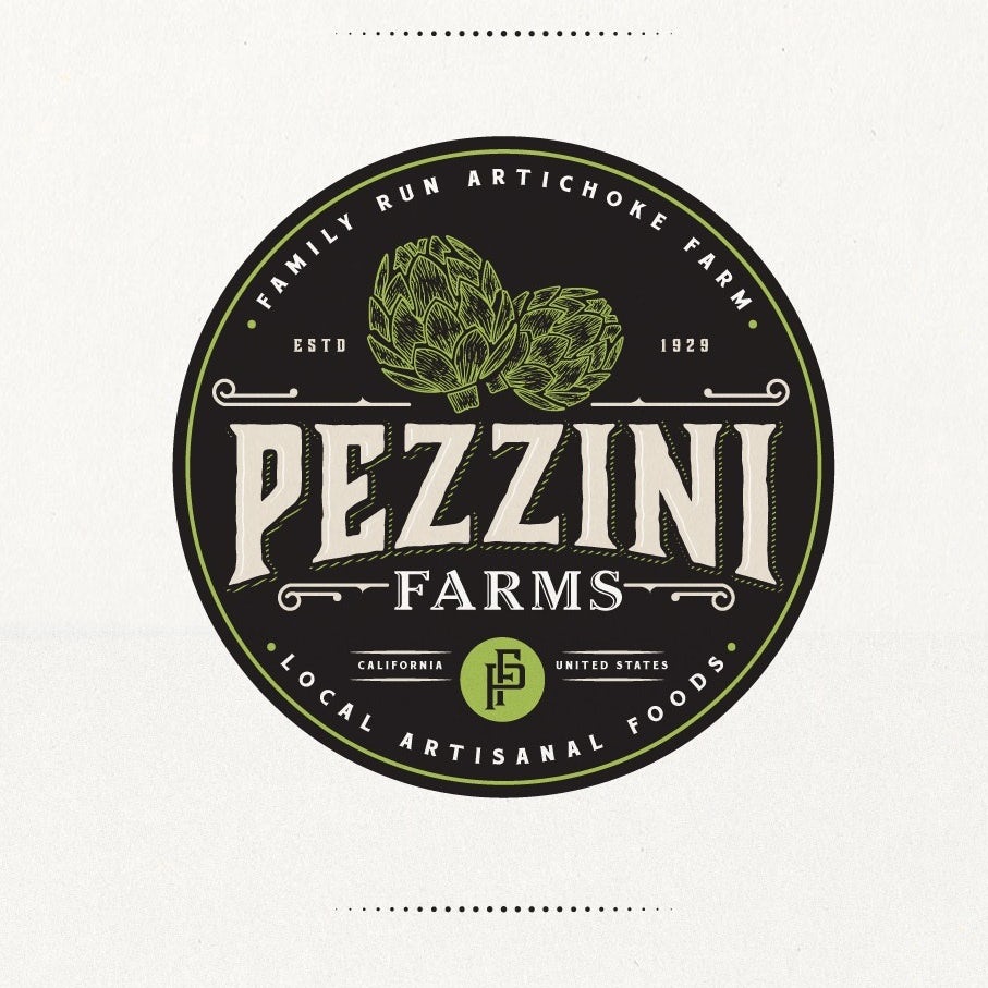
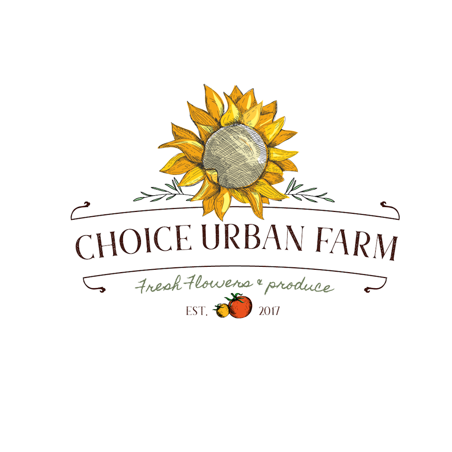
One of the most time-honored uses of logos is to simply display the product. This is an especially good idea for produce or meat. Not every single berry or leaf is going to look exactly the way you want. But you can use your logo to present an idealized version of your product.
The entire purpose of a logo is to put your best face forward. Show the the people buying your food what it means to you. Is it the biggest vegetables? The healthiest meat? The shiniest fruit? Picture what your product means to you, and put that in your logo.
Modern farming
—
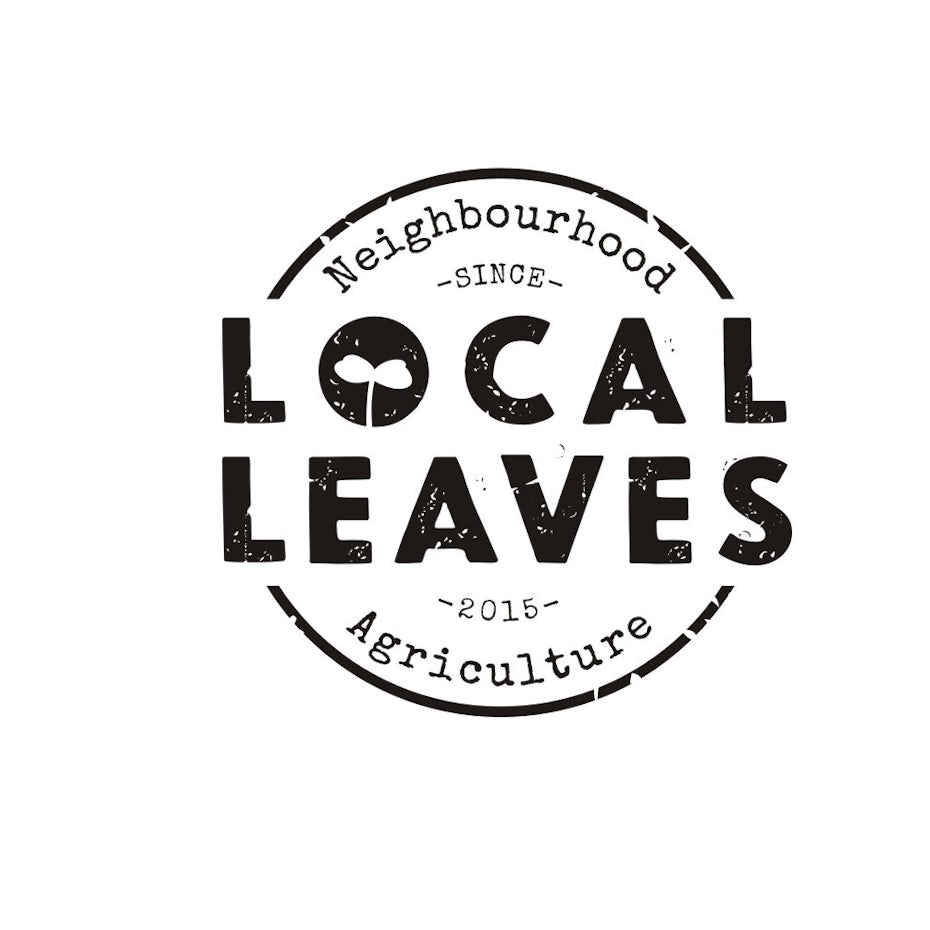
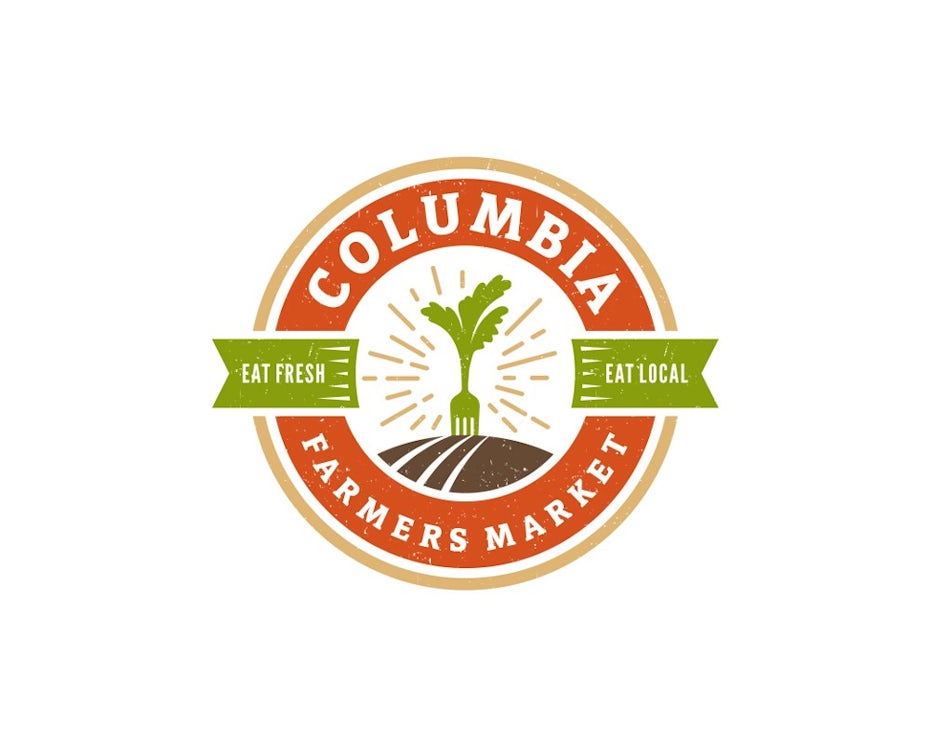
If you’re using cutting-edge farming techniques (such as hydroponics or monocultures), you might want to consider using a modern logo, too. Modern designs focus on a clean look and communicating information. Flat, primary colors, sans serif fonts and minimalist imagery are all hallmarks of modern designs.
But “modern” doesn’t necessarily mean “present day.” Faux-vintage is a popular trend right now. You can add some wear and tear to your logo (as with the Columbia Farmers Market seen below), to make it feel hip, funnily enough. There’s nothing to stop you from using rustic or old-timey tools in your modern logo. Despite the name, it’s a timeless style that can work in many different eras. (If you want more ideas, check out the latest logo trends!)
Show your work
—
Farming is difficult. Everyone knows it, and, more importantly, appreciates it. By putting a farmer, or Farming tools, on your logo, you’re reminding people that this isn’t just food that magically appeared on their plate. Somebody planted it, harvested it, or raised it. It creates empathy, so the buyer can identify with you and all the work you’ve done. Suddenly, the price doesn’t seem too much.