The wait for fashion fans is over: it’s London Fashion Week. And if there is one thing we can rely on in the world of fashion, it’s the endless variety of designs. While brands like Burberry or Emilia Wickstead represent classic chic and timeless minimalism, designers like Ryan Lo or Molly Goddard dare to experiment with eccentric colors and cuts.
Despite the incredible variety of the fashion scene, these designers set themselves apart from the mainstream. You want your fashion startup to have this kind of recognition value? The right logo can help you with that. No matter what makes your brand unique, you want your logo to communicate it to your clients. Let us inspire you with our round-up of fashion logo types. So you can find the logo that fits your brand like a glove.
Feminine fashion logos:
—
Dreamy and delicate
”I think the most important thing to keep in mind when designing a fashion brand logo is to be able to capture visually the essence of the style that the retailer represents. In the case of this logo, they wanted a retro, feminine feel to match the clothing style and accessories that they seek out from all over and re-sell.” – designdazzle
Stylish and chic
Elegant and classic
“The concept I chose for this brand is minimalistic with a hand drawn design. Because the modern style for fashion brands can be very mainstream, I decided to give this logo a fresh design with a more artistic look. That makes it different from other fashion logos.” – BLVCKMASS
First things first: some fashion brands out there focus either on women or men. They try to appeal to their target group by emphasising the femininity or masculinity of their style. So how can you do it? Your choice of colour for your logo already says a lot about your brand. Feminine logos often go for pastel colour palettes and they are not afraid of embellishments, floral illustrations and hand-drawn fonts. Still, there are different types of feminine style. Here are some options of how you can express the facets of a feminine brand in your logo.
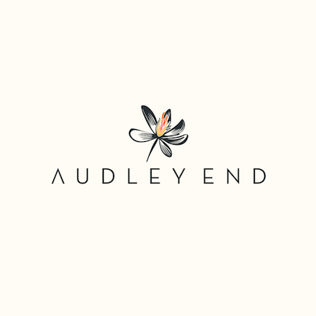
While the Evellon Boutique logo creates a delicate atmosphere through its light, floral design, the logo for personal stylist Lauren Kitchen expresses stylish femininity with the use of a more traditionally masculine colour palette with an illustration of a strong female character. Classic logos on the other hand use clean or traditional fonts and sophisticated illustrations, like the one for Audley End. This gives them an elegant and timeless feel. Whether you decide to go for a fashion forward, dreamy or elegant logo: your design can express the specific type of feminine style that fits your brand.
Masculine fashion logos:
—
Strong and dynamic
Elegant and classic
“Originality is absolutely key. I like my designs to tell a graphic story and to be rich and deep in content. Fashion is like art, and deserves to have a unique signature.” – scribe
Relaxed and cool
“The fashion brand logo must clearly represent the company and its products. It must also be easily appreciated by its market.” – jayvee
If you are looking to give your fashion brand a masculine feel, these logos can help you to get it right. Masculine Logos often have a couple of things in common: dark colour palettes, capital lettering and bold design. So they are pretty much the exact opposite of the feminine logos above. These brands try to sell not only clothes but a lifestyle. Your brand is athletic, exclusive or relaxed? Your logo transmits this message to your target group.
Logos like Oneself Gear or Probrowear evoke a strong and dynamic feeling. On the completely other end of the spectrum the logo for Charles Laurie wants to express elegance and quality with their classic font and a traditional style of emblem. The worn look of the seal-type logos of Retric and Difranzo results in a relaxed and cool style. All three logo types present different fashion styles and target different men, but all of them clearly leave a masculine impression.
Graphic and minimalist logos:
—
“Trending right now for fashion are logos with thin lines. Effects like missing links in the typeface and simple illusions will result in a very sophisticated look for the fashion brand. A fresh, clean look enables the logo to present something memorable and timeless.” – creamworkz
“I would say that the versatility of the logo plays a big role when it comes to the fashion industry. In my opinion, a sort of ‘flat style insignia’ is a really good choice for modern, trendy fashion brands in 2017. Good typography, of course, is also something that simply MUST be a part of a good fashion brand.” – Mijat12
“The logo is simple, but it summarizes the name of the brand in its design. The round logo with the zigzag lines are simultaneously associated with the waves of the ‘ocean’ and the ‘cake’.“ – Milica Milosevski
Graphic and minimalistic logos are clearly on trend. This logo type is modern, but classic and timeless at the same time. They have a tendency for clean lines and monochrome simplicity, which makes them perfect for brands that want to emphasize their understated and modern style. If your target group is cool and fashion-forward, this logo style with its sans-serif fonts and black-and-white graphics may be the one for you.
Logos like FOLD and UNTD show their modern side through graphic symbols and letters. They are simple but memorable. Minimal and modern fashion logos like the one for Tech Closet play with typography and the brand’s initials. The simplicity and black-and-white contrast of these logos draws all attention to the brand name. Without question, fashion startups that use this logo type simply seem cool.
Logos that hint at the craft behind the brand:
—
“Just open your mind to all possibilities, be your authentic self, and instead of calling it work, realize it is play.” – EARCH
“In order to stand out from the competition a logo must convoke a singular universe and must have a strong identity that matches the garment style. Custom lettering is essential. The way of “dressing up the word” is essential. That way, the logo becomes unique and makes the wearer unique.” – C1k
“I feel like trending for 2017 will be simple flat design with great and deeper meaning incorporated behind the logo.” – gogocreative
“Fashion interacts on such a personal and intimate level with its clients. What you wear communicates your values and personality to the world, so trust is important. For branding, I draw from history to establish a fashion line’s place along the continuum of design, and allow the creativity of their own work to have the loudest voice.” – green in blue
Specifically brands that produce or sell handmade fashion pieces like to show off their quality with their logo. You can create a connection to the craft behind your brand by incorporating the tools of your trade in your logo. Illustrations of needle and thread, sewing machine or scissors remind of the labour-intensive production process and stand for skill and quality. Which style in particular you can express with this type of logo entirely depends on the style you choose for the illustration, colours and fonts.
The logo for Fabricante Pablo conveys tradition and quality through the hand-drawn look of the illustration and a fitting handwritten font. In the logo for Bodega Vintage the embellished vintage-style illustration of a sewing machine communicates the boutique’s style. The logos for Design Studio Vulkana and Countermeasure combine a modern and graphic look with just a hint of traditional fashion craft by integrating needle and thread into the initials of the brands. It’s an ingenious way of reminding your customers of the craft behind your brand.
Shiny metallic fashion logos:
—
“In fashion, more than in any other industry, it is the logo that both complements and completes a fashion brand. The key is in simplicity, edge and timelessness.” – Trails
“The brand Fit Style sells fashionable fitness wear for individuals that prioritize their health and fitness, but also enjoy their sense of style. The main challenge was combining two worlds – sports and elegance, which was achieved with a strong symbol that communicates ‘Fit’ and ‘Style’ being one as well as a slightly softer, sophisticated and luxurious typography.” – BlueMoon
It’s not rare to see fashion brands using gold or silver metallic logos to express exclusivity. The shiny shapes and monograms really stand out in front of a dark background and practically scream luxury. Metallic effects create different feelings depending on the tone you choose. While gold and copper tones seem warm, elegant and more traditional, silver and steel tones create a cool, distant and modern atmosphere.
This is why the golden logos for Luveal and Gaea are finer and more complex and elegant. The steely Fit Style logo on the other hand is bolder and transmits a feeling of power and luxury. The shiny effect makes these logos different and sophisticated.
Cute logos for kids fashion:
—
“I think the logo works well because it’s simple. It has a simple font but with a hint of cuteness. Similarly, the bird is simple but cute. This makes the brand fun and fitting for the children’s market.” – Cit
Kids’ fashion without cute animal designs? Unthinkable! Kids’ brands like Bon Mignon and Little Miss Cupcake use creative child-friendly illustrations of their mascots to express their playful style. They leave a happy impression with their light and bright colours.
Sometimes fashion brands for kids are cute or embellished and sometimes they can even be cool or elegant – it all comes down to the parents’ fashion sense, which a brand tries to appeal to. But even in the logos of sophisticated kids’ brands there has to be a little cuteness. The logo for Little Bedoo shows how to bridge this gap with combined font styles and an unobtrusive shell illustration.
The right logo dresses up your brand
—
Young fashion startups often find it difficult to assert themselves next to big, established fashion brands. Your logo can help you stand out from the crowd and attract the attention of exactly those fashion fans that will love your style.
That is why your logo should perfectly mirror your brand’s style. Is your fashion sporty, classic or minimalist? Or maybe a cross between different styles? The right logo type expresses exactly that. This way your customers will notice at first glance that your brand is right up their street.
Our briefing process helps guide you through what attributes you want to select and see in your logo. So why not get started and find the perfect logo for your brand?