Categories
How it works
Find a designer
Inspiration
Studio
1 800 513 1678
Log in
Log in
Home
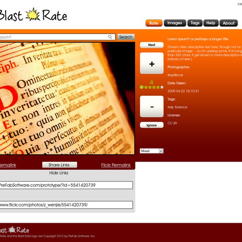
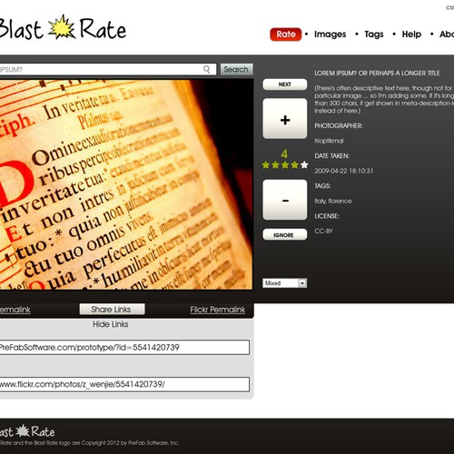
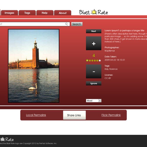
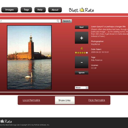
Web page design
Web page design contests
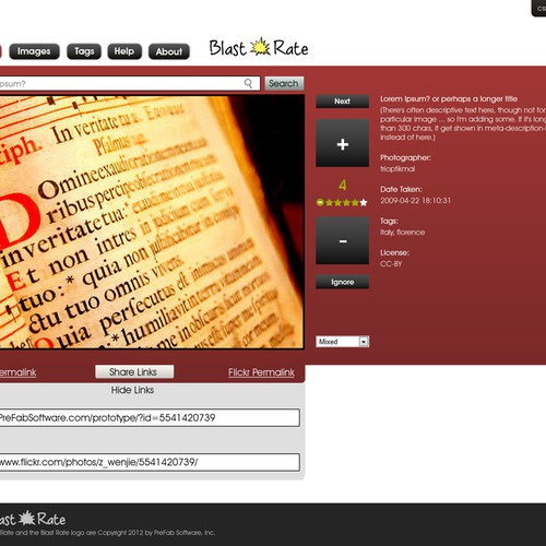
website design for Blast Rate
website design for Blast Rate
by
Blast Rate
100% (10) of active designers received comments
50% rated or declined designs
2 contests (0 refunds)
Guaranteed
The client has guaranteed to award the prize.
Blind
Designs are hidden from other designers until the end of the contest.
Watchers
(10)
10 people are watching for updates.
Brief
Designs
(64)
Designs
(64)
Brief
Designs
(64)
Share on Facebook
Share on Twitter
Share on Pinterest
This contest has finished. Congratulations to the winning designer
Project Rebelation
!
Winning entry
#32
by
Project Rebelation
Deleted by 99designs
Withdrawn by designer
Declined
Winner
Entries
All
(6)
All (6)
Unrated (4)
1–2 stars (0)
3–5 stars (2)
Declined and withdrawn (58)
All
(6)
Unrated
(4)
1–2 stars
(0)
3–5 stars
(2)
(58)
#32
by
Project Rebelation
Deleted by 99designs
Withdrawn by designer
Declined
Winner
#25
by
Project Rebelation
Deleted by 99designs
Withdrawn by designer
Declined
#61
by
Project Rebelation
Deleted by 99designs
Withdrawn by designer
Declined
#60
by
Project Rebelation
Deleted by 99designs
Withdrawn by designer
Declined
#54
by
Project Rebelation
Deleted by 99designs
Withdrawn by designer
Declined
#53
by
Project Rebelation
Deleted by 99designs
Withdrawn by designer
Declined
Home
Browse categories
How it works
Find a designer
Inspiration
99designs Pro
Design services
Design contests
1-to-1 Projects
Find a designer
Discover inspiration
99designs Studio
99designs Pro
Get a design
Logo design
Business card
Web page design
Brand guide
Browse all categories
Support
1 800 513 1678
Help Center
Resources
Pricing
Become a designer
Blog